UI/UX Design
Interaction Design
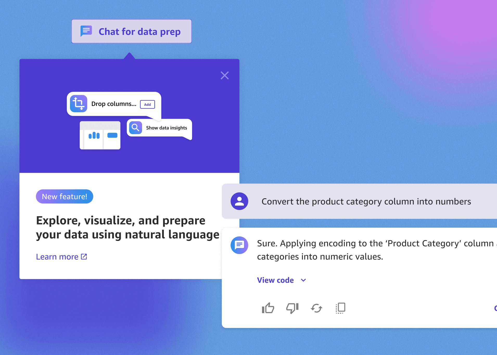
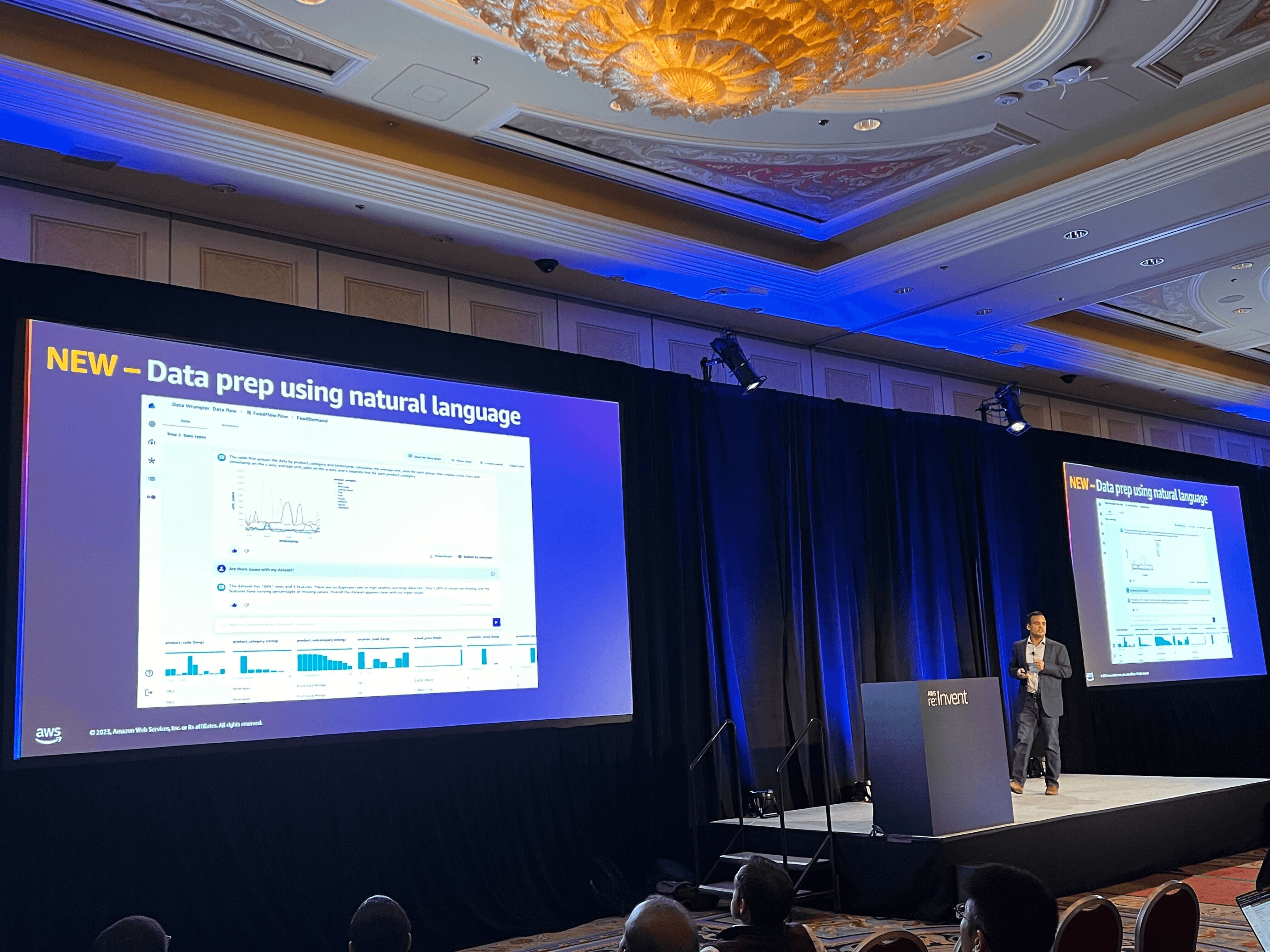
Simplifying complex workflows with an AI driven chat experience
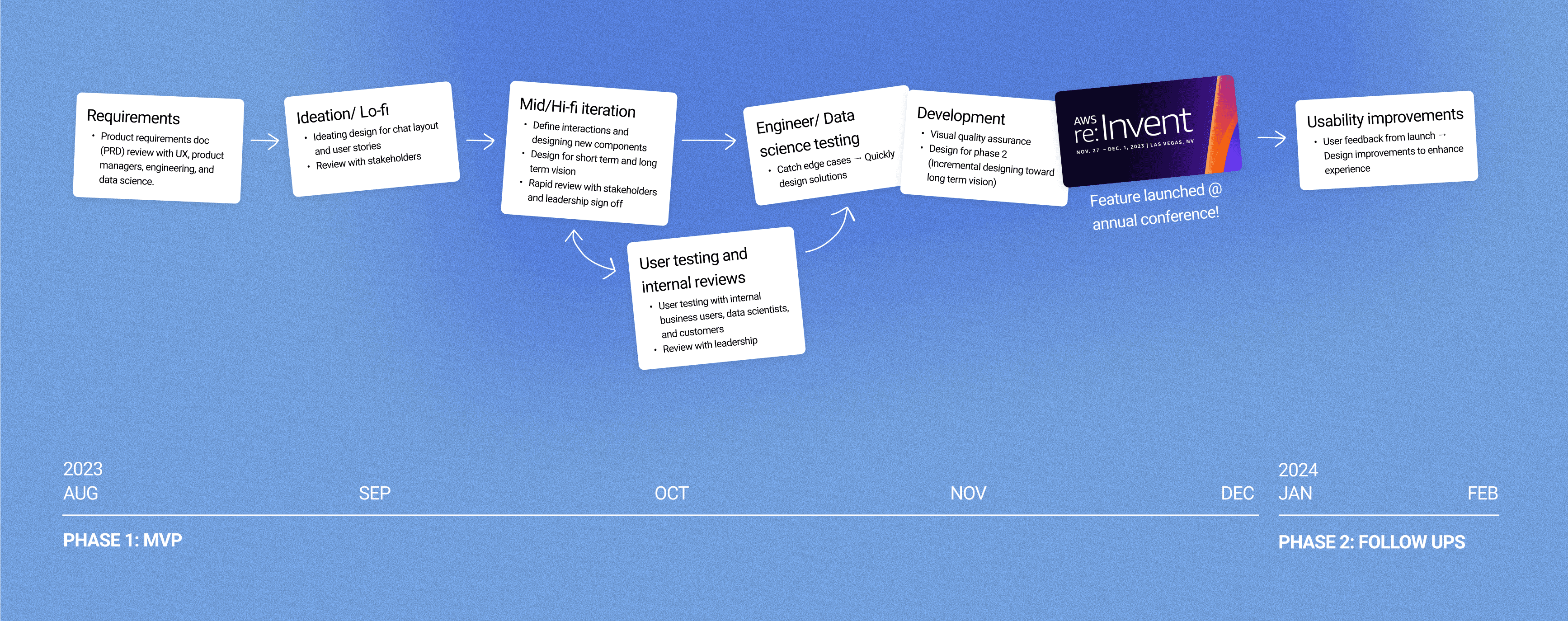
How might we make data preparation faster and easier for business users? As a 3-month initiative leading up to Amazon re:Invent 2023, I designed a 0→1 chat experience that helps users prepare data for machine learning workflows using natural language.
Role
UX Designer
Team
3 UX Designers
2 PM
5 Data science
6 Engineers
Timeline
6 Months
(Aug 2023 - Jan 2024)
Background
In Q3 2023, the SageMaker Canvas team initiated a new effort to integrate a conversational AI experience for data preparation.
The constraint was a 3-month timeline compounded by daily shifting requirements due to real-time machine learning testing and high cross-functional dependencies.
My contributions
I designed and delivered end-to-end UX interactions, validating flows through rapid reviews and user testing, and supported building out foundational design system components. This effort ensured the on-time launch of a new feature that gave business users the power to access machine learning capabilities through a user-friendly interface.

Problem
Customers were seeking for an easier and quicker way to prepare and analyze their data.
The foundation of building effective machine learning models is data. At the time, users in Canvas were able to prepare their data (to be cleaned in a specific format) through point and click interaction to achieve their desired business outcomes, but they were asking for a simpler way.
How might we
How might we helps business users quickly and easily prepare and understand their data so that they can focus on business problem-solving rather than tedious data cleaning tasks?
Users currently have to go through many manual steps and know technical terms to prepare data which created confusion, frustration, and slowed down their process of cleaning their data and extracting data insights.
Solution
Design a guided conversational AI chat interface that lets users analyze, clean, and visualize their data in plain language quickly and confidently.
The goal is to support the user to accomplish their tasks easily while giving them control over every step of the process to--- turning a once complex, timely process into an approachable, guided experience.

Outcome
Time to complete data tasks cut down 47% from hours to minutes.
30% increase in product adoption in the first quarter of unique users
Launched at AWS re:Invent 2023, it drew strong positive engagement and early adoption from Fortune 500 customers, with feedback praising its simplicity:
“This was a great session and loved the demos” - Demo workshop customer at Re:invent
“It is very cool to see all the data prep capabilities in Canvas and that too with the ability to use simple natural language” - Demo workshop customer at Re:invent
"Now I am wondering if everything I built for the last 5 years for customers has to be thrown away because you are making ML data prep so easy! I am thinking I will just have my customers use Canvas for data prep." - London workshop attendee from European Central Bank
This moment validated our UX approach of turning a highly technical workflow into a guided, conversational interaction that resonated with both technical and business users.
Check out more details on AWS News Blog and AWS on Air at re:Invent!

Where it started
I joined the team as a new designer and was immediately tasked with delivering a new feature under a tight deadline in a domain I had no prior knowledge of.
I quickly took the initiative to learn about how users were engaging with the product by doing workshops and diving into the user journey. Despite the technical complexity and ambiguity, I drove designs forward by focusing on the user goal and grounding design decisions in usability and clarity. Through close collaboration with cross-functional partners, I was able to successfully deliver the project for launch at Re:Invent 2023 (Amazon AWS's annual tech conference).
An agile process
Designing & iterating quickly as things were shifting on the daily
Within a tight 3 month timeline to deliver an end to end chat experience in Canvas from the bottom up, the design process was highly cross team dependent, fast pace, and always shifting.
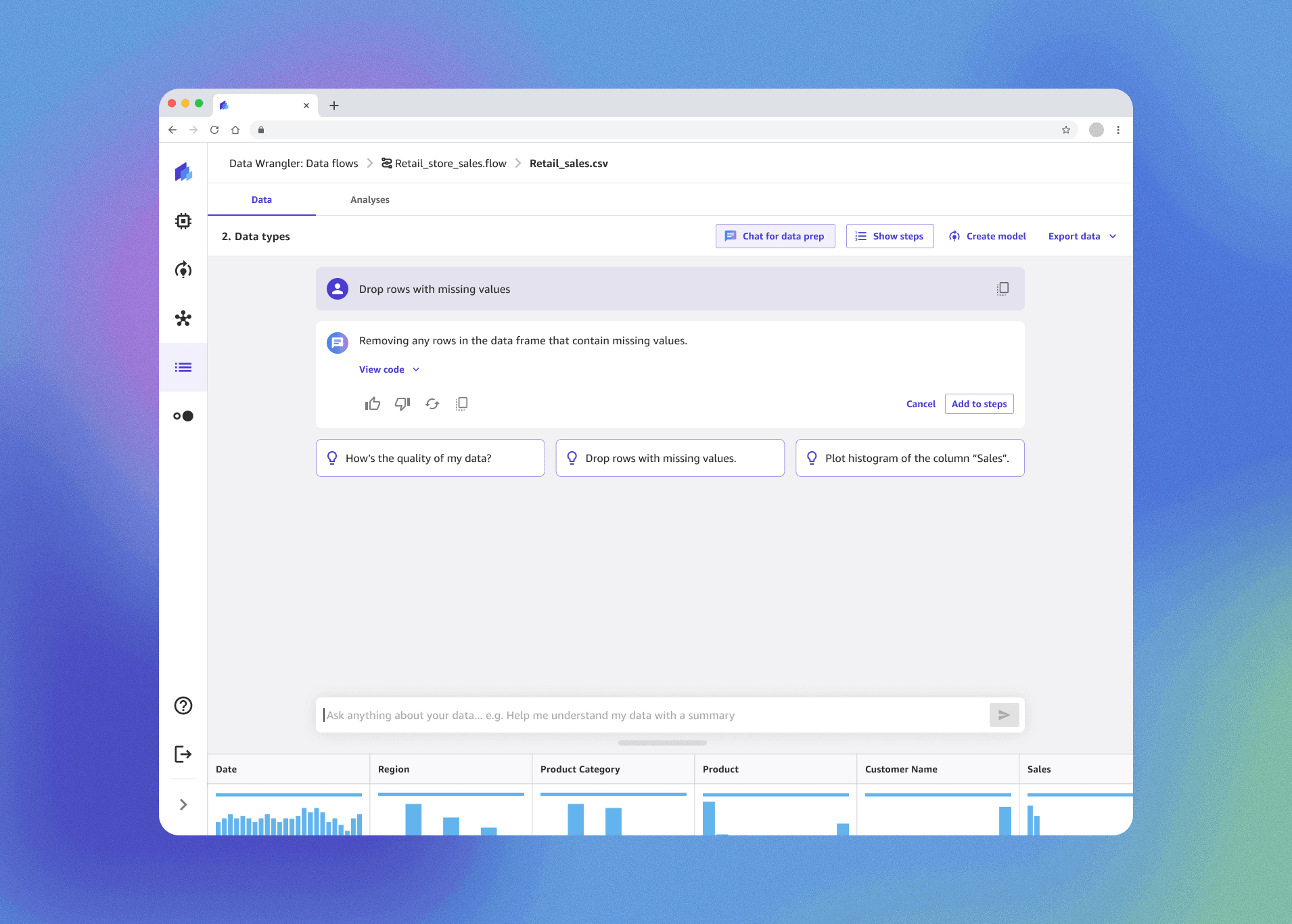
Current experience
The existing Canvas experience required users to interpret technical terms, dig through menus, and repeat multiple clicks to perform simple data operations.
💡 Data prep is often the hardest and most time-consuming part of the workflow — sometimes taking up 80% of a data scientist’s time.
Pain points in the current experience
Non-technical users often felt uncertain about which transformation to choose or what each one did, leading to slow progress and low confidence.

Uncovering the problem & opportunity
In customer calls, users were asking for an easier and quicker way to clean, analyze and visualize their data.
The product manager, engineers, and UX design team gathered heads, and we saw an opportunity to make the experience feel easier and more natural through an AI assistant. The concept was validated with 8+ key customers, signaling a large growth opportunity.

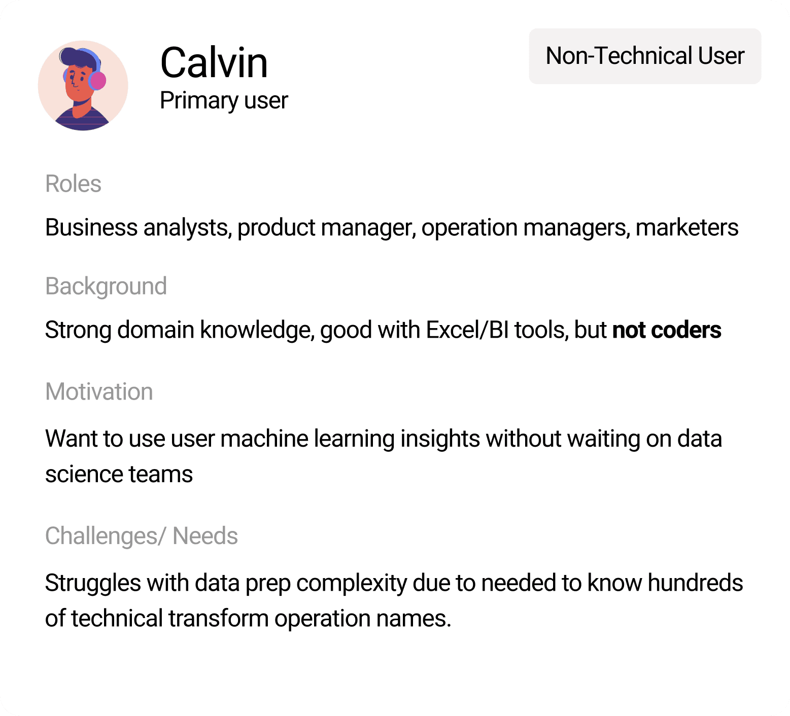
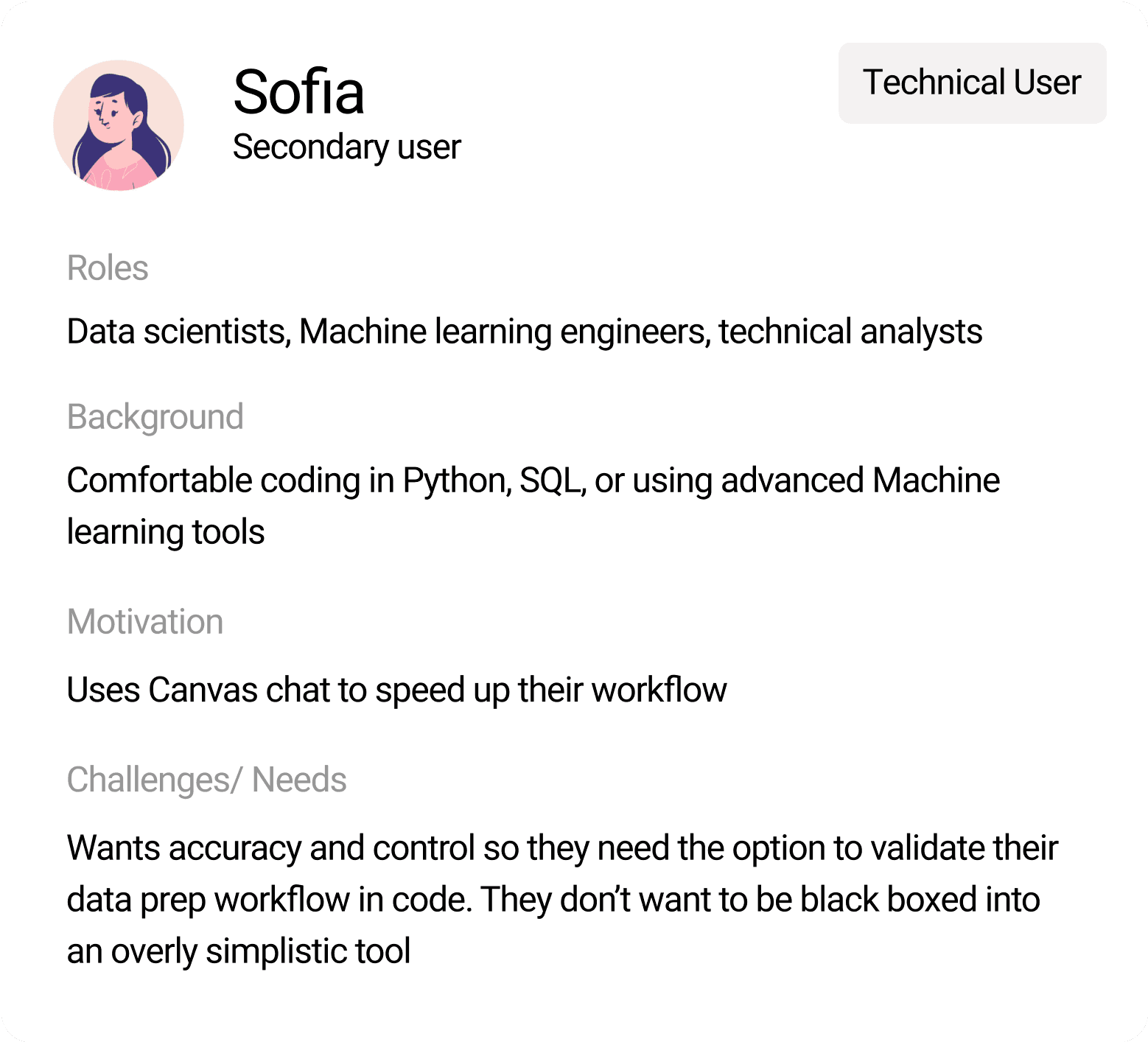
Key user personas
While designing for the primary non-technical users, it was important to give technical users advanced capabilities.
While delivering value for the non-technical user, technical users should still feel empowered to use the chat to accelerate their workflow, and not feel black-boxed from the technical operations happening behind the scenes.

Design goals + Guiding principles
I put together guiding principles for designing with AI to ensure a user controled experience.
Every design goal had to consider how AI behaves. So it was important to ensure the experience remained clear, human-guided, trustworthy, and inclusive, even as the system evolved.

Initial designs
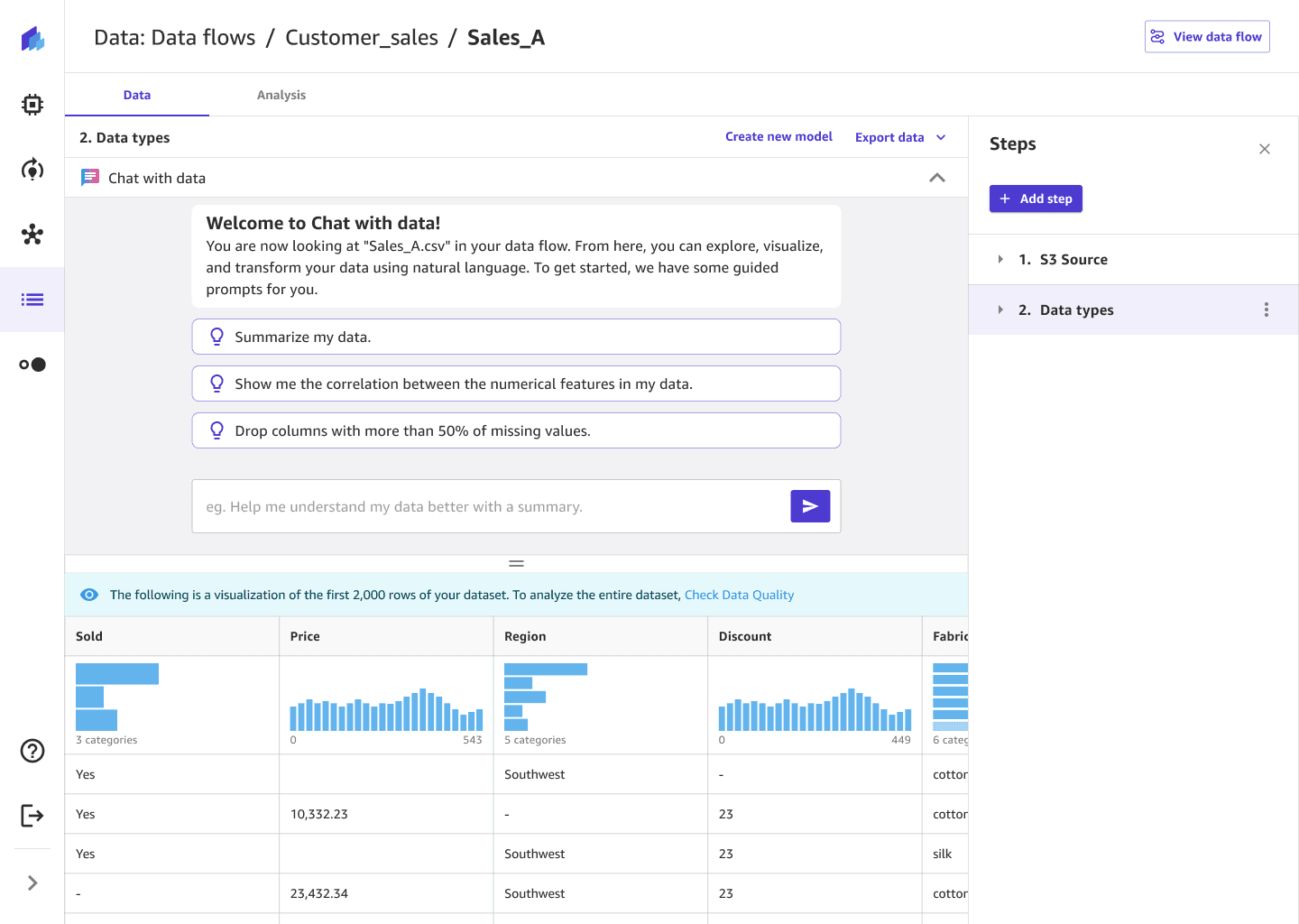
I mapped out happy path flows to explore how the chat interface could scale and support different user intents.
Through several iterations and reviews with senior designers, I refined the structure from early V1 concepts to a more focused and scalable V2 experience.
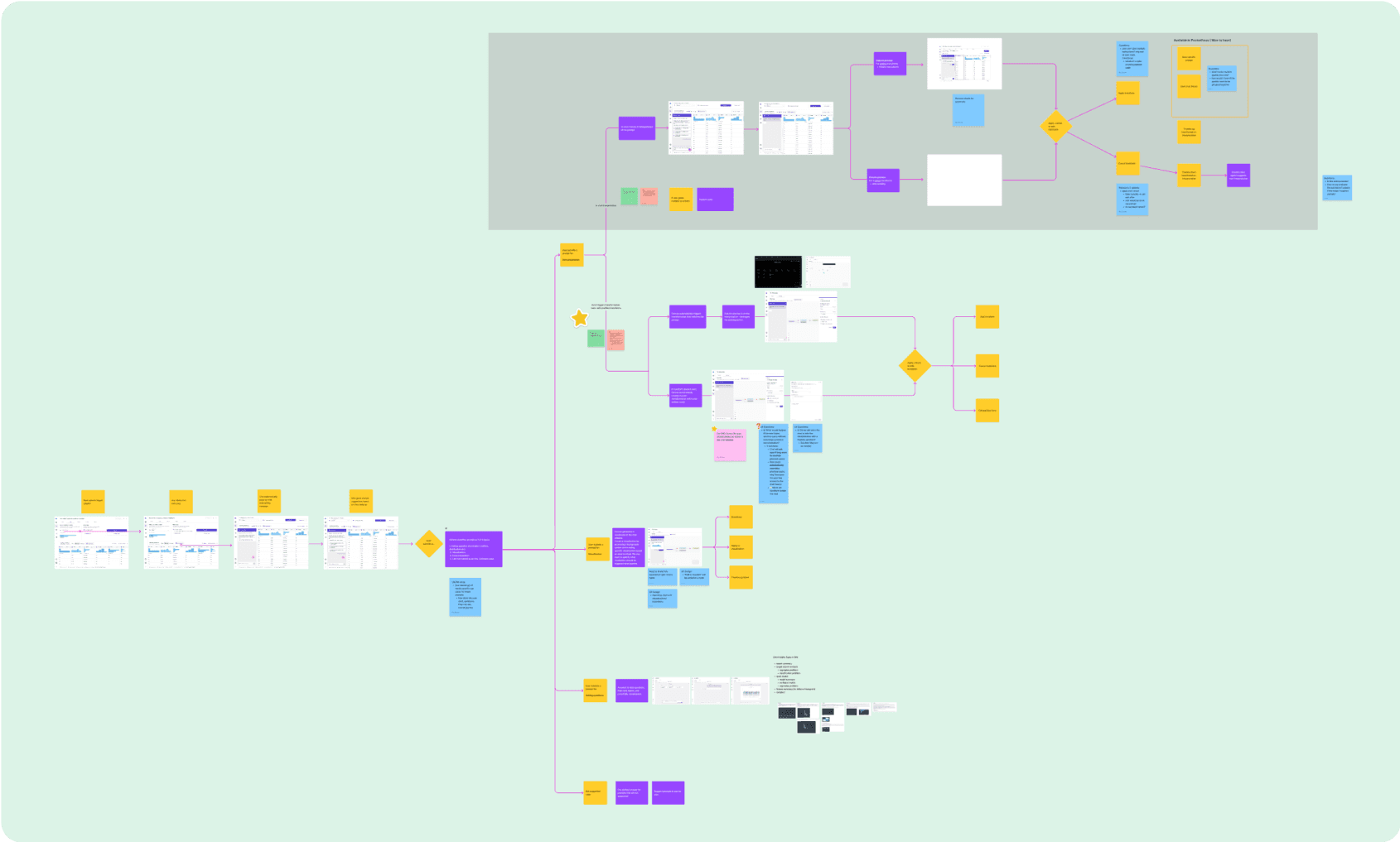
Happy path V1

Happy path V2
Design iterations
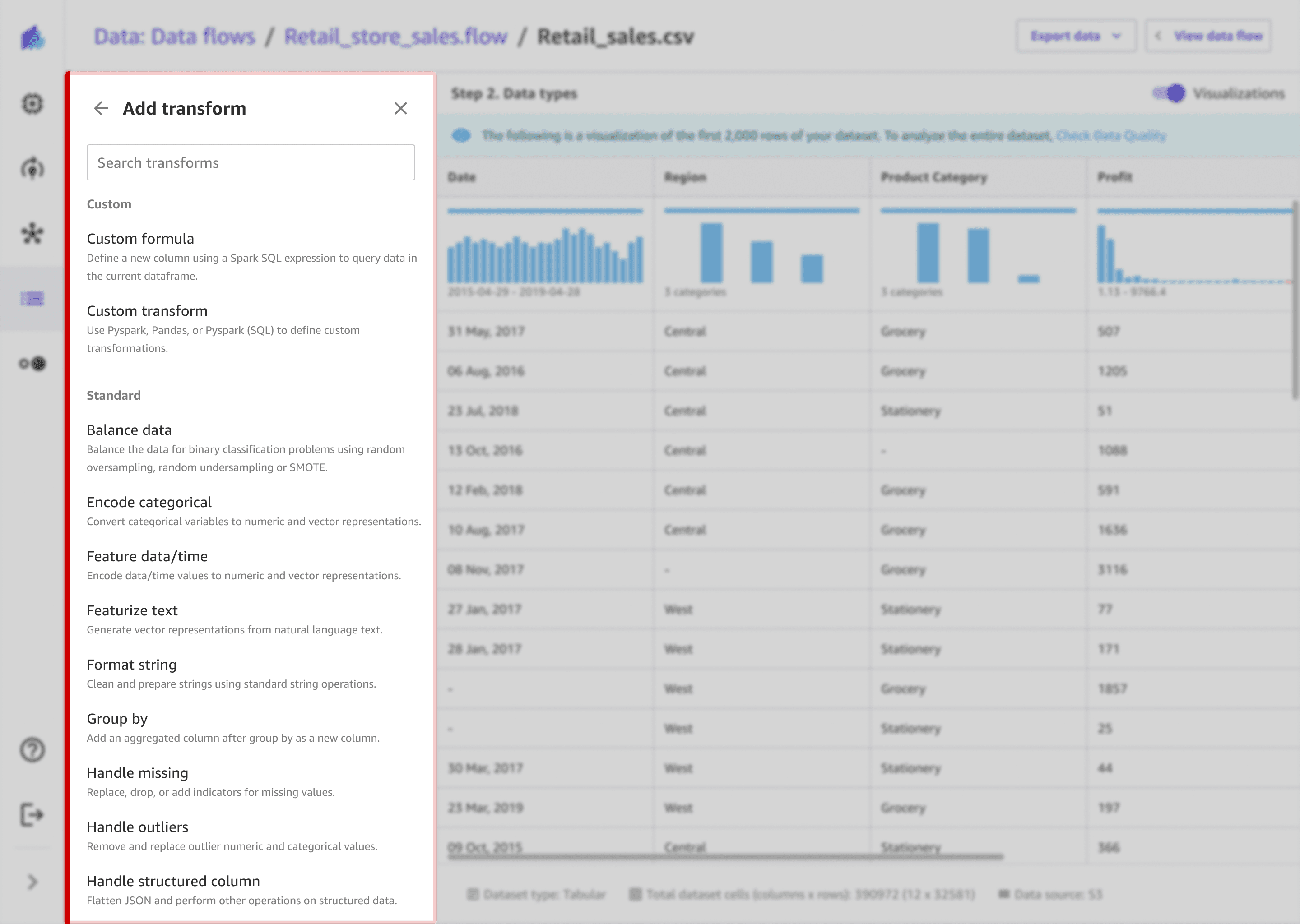
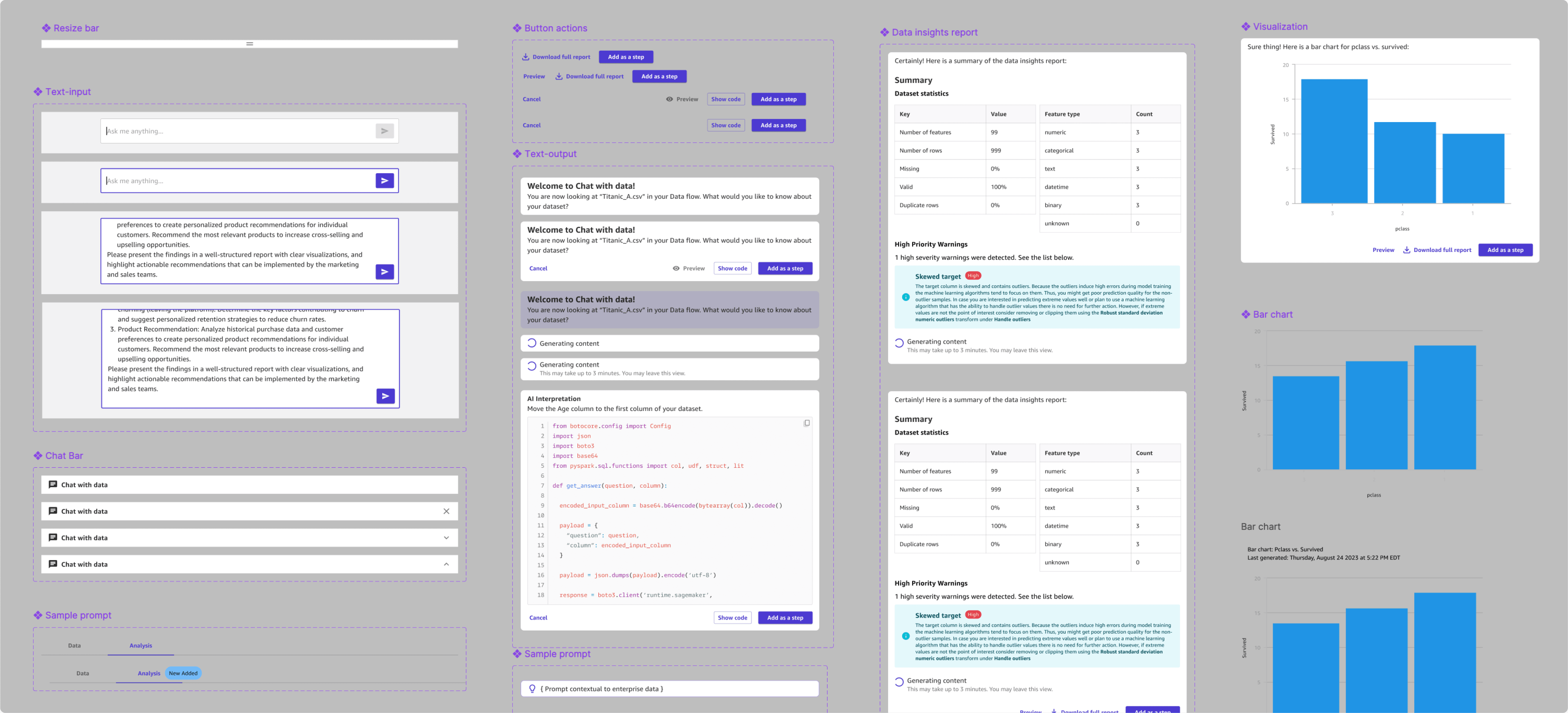
Designing an optimal chat layout
I explored multiple directions balancing usability, information density, and discoverability of actions. I worked closely with the PM with 2 other UX designers through working sessions and iterated concepts until we landed on a design direction to build upon. I had my first initial UX design mock review 1.5 weeks after PRD kick off.
Click arrows to see previous version!


The final layout was chosen for its balance of clarity, contextual relevance, and technical feasibility.
It keeps users grounded in their data while they chat—maintaining visibility of columns and transformations without losing focus. The embedded layout allows seamless back-and-forth between analysis and conversation, minimizing cognitive load and supporting a smooth, uninterrupted workflow.

Detailed iterations
Testing key features and iterating to improve the easy of use
I had 11 design iterations and ran Single Ease Question (SEQ) tests with 7 data scientists and analysts over multiple designs to measure the users’ perceived difficulty of different tasks. I built out prototypes to test with the users. Early prototypes scored an average of 4.5/7, indicating issues with clarity, screen real estate, and navigation between panels. Through rapid iteration — simplifying layouts, refining chat placement, and improving contextual clarity — the average SEQ score increased to 6.5/7.


The full screen view is more intuitive and cleaner as it explicitly focusing on one experience.
- Solutions architect
Design solution
Defining the end-to-end user experience interactions
After 8 iterations and user tests with internal stakeholders, users, and customers, I designed the end to end UX with the guidance of a senior UX designer and product manager. The designs evolved as I received continuous stakeholder and customer feedback, while also being informed by technical feasibilities.
Goal 1
Before
Lack of guidance: The interface offered no guidance or suggestions, so users struggle to know where to start or what actions to take.
Low choice confidence: The transform names were technical (“encode categorical,” “handle missing”), making it unclear which was right for their task.
Lack of clarity in results: Users couldn’t see immediate results or know if their settings were correct without committing time to extra clicks.
After
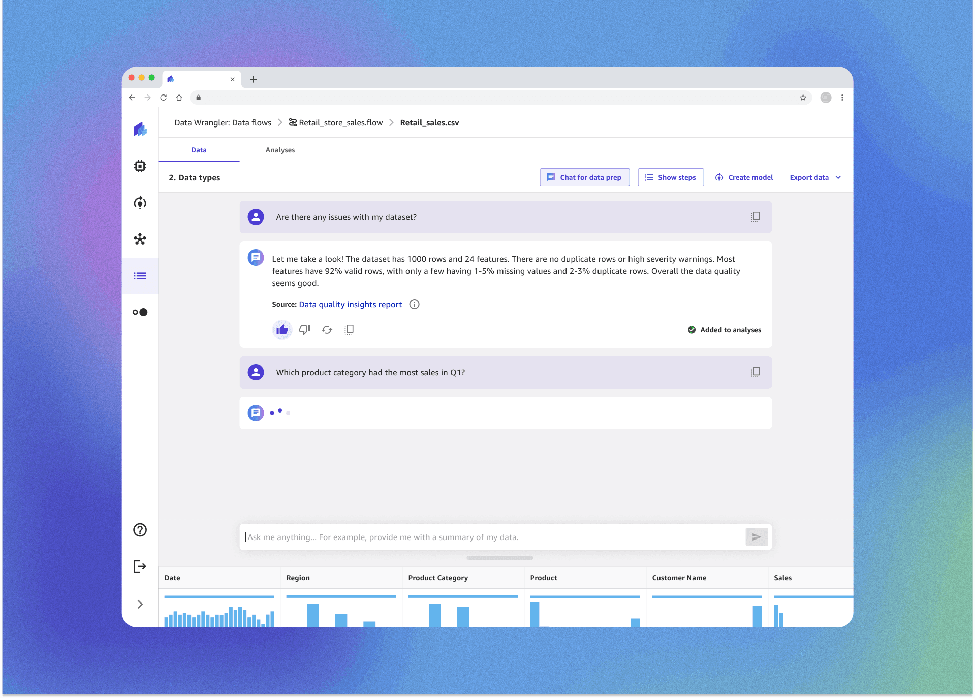
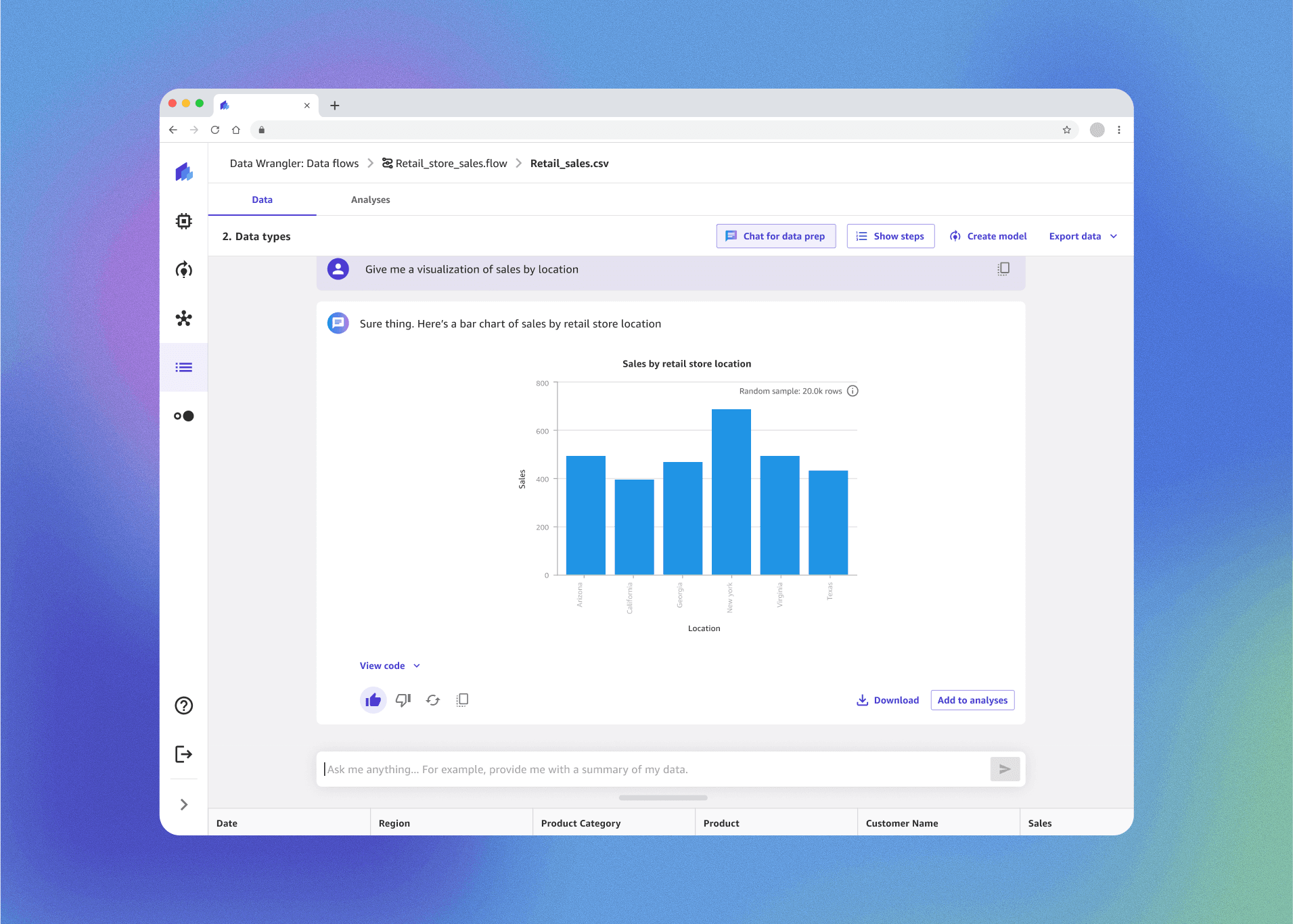
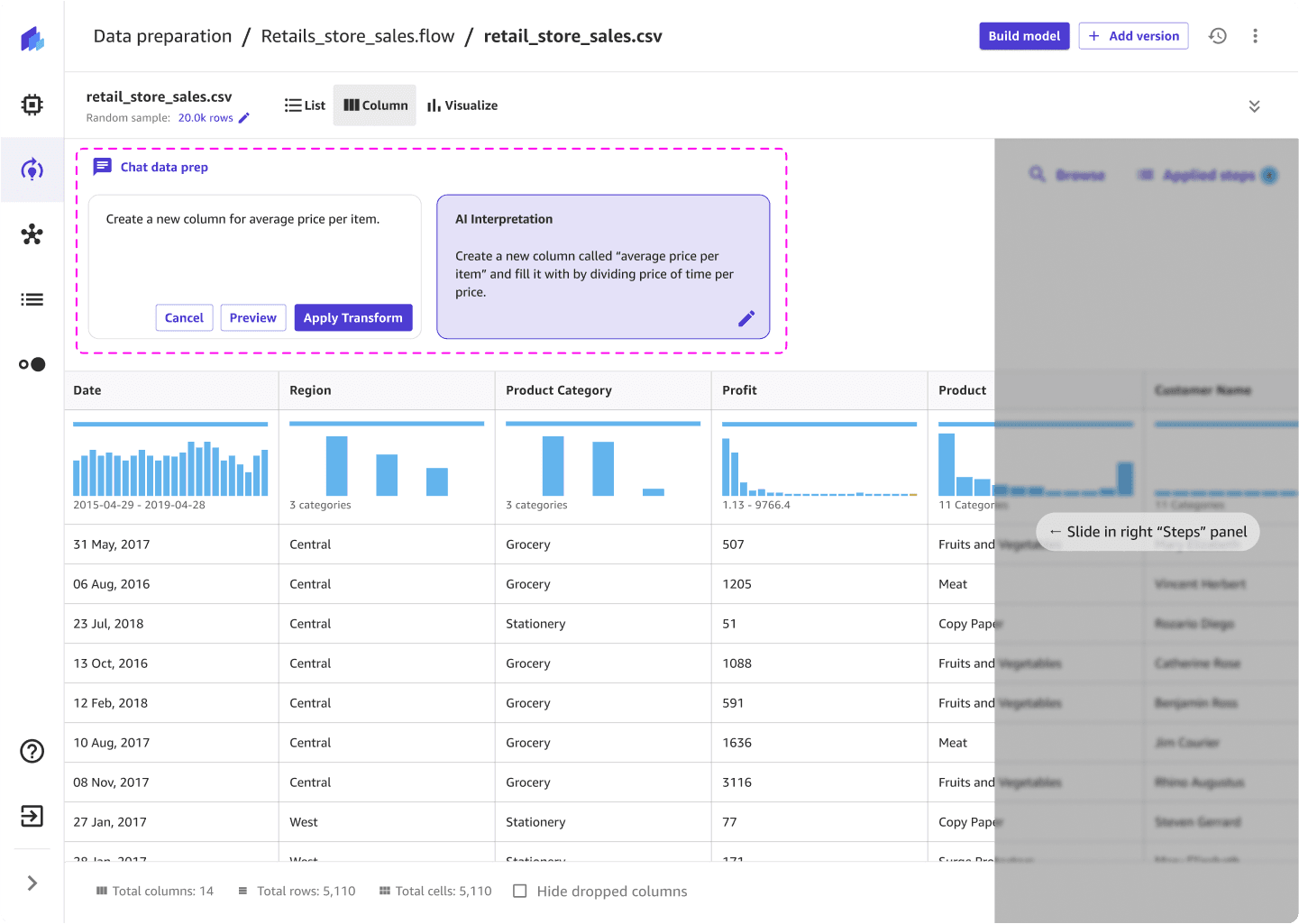
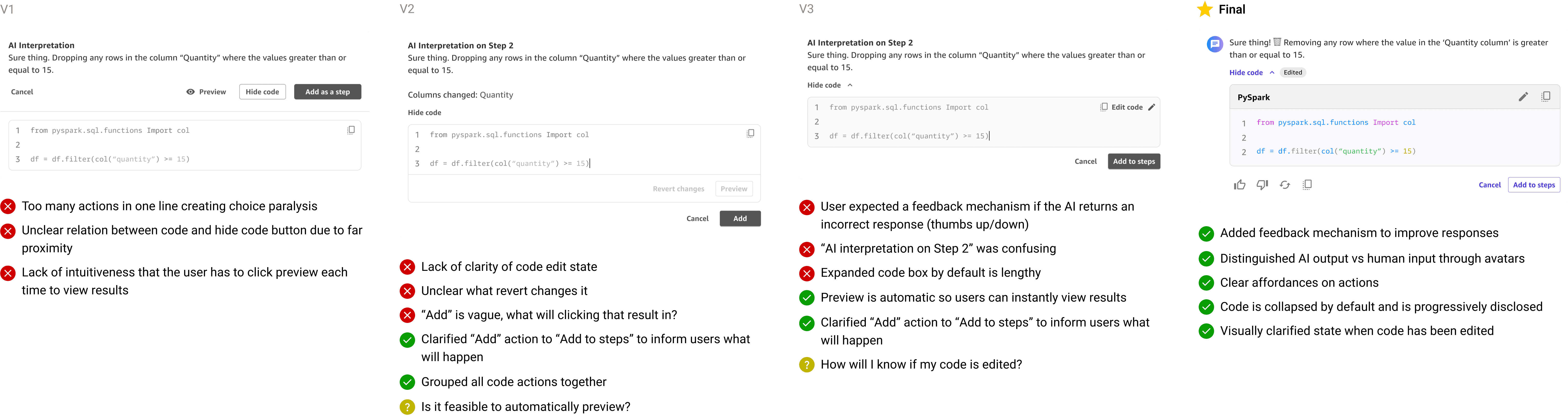
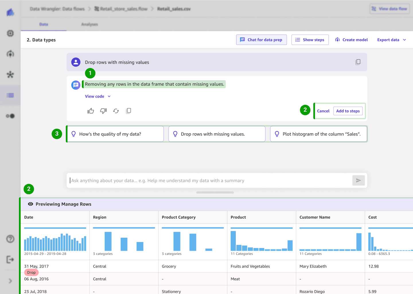
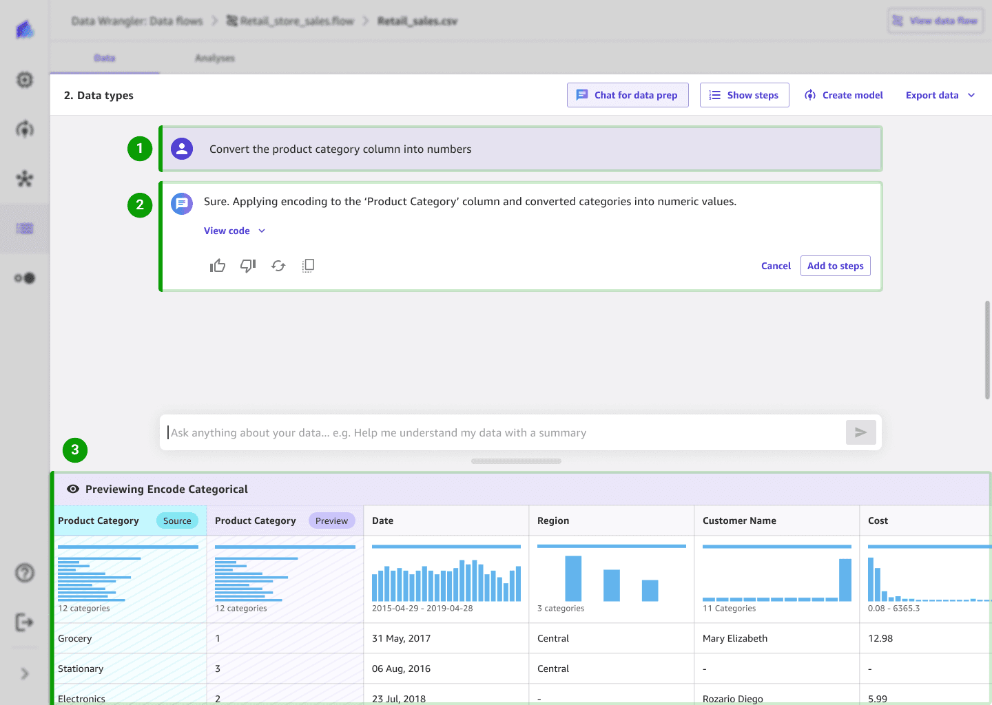
Make confident choices: The system interprets the user’s intent in plain language so users feel in control of the outcome
Verify actions before applying to build trust: Automatic live previews show instant changes—removing the need for manual preview clicks and reinforcing trust.
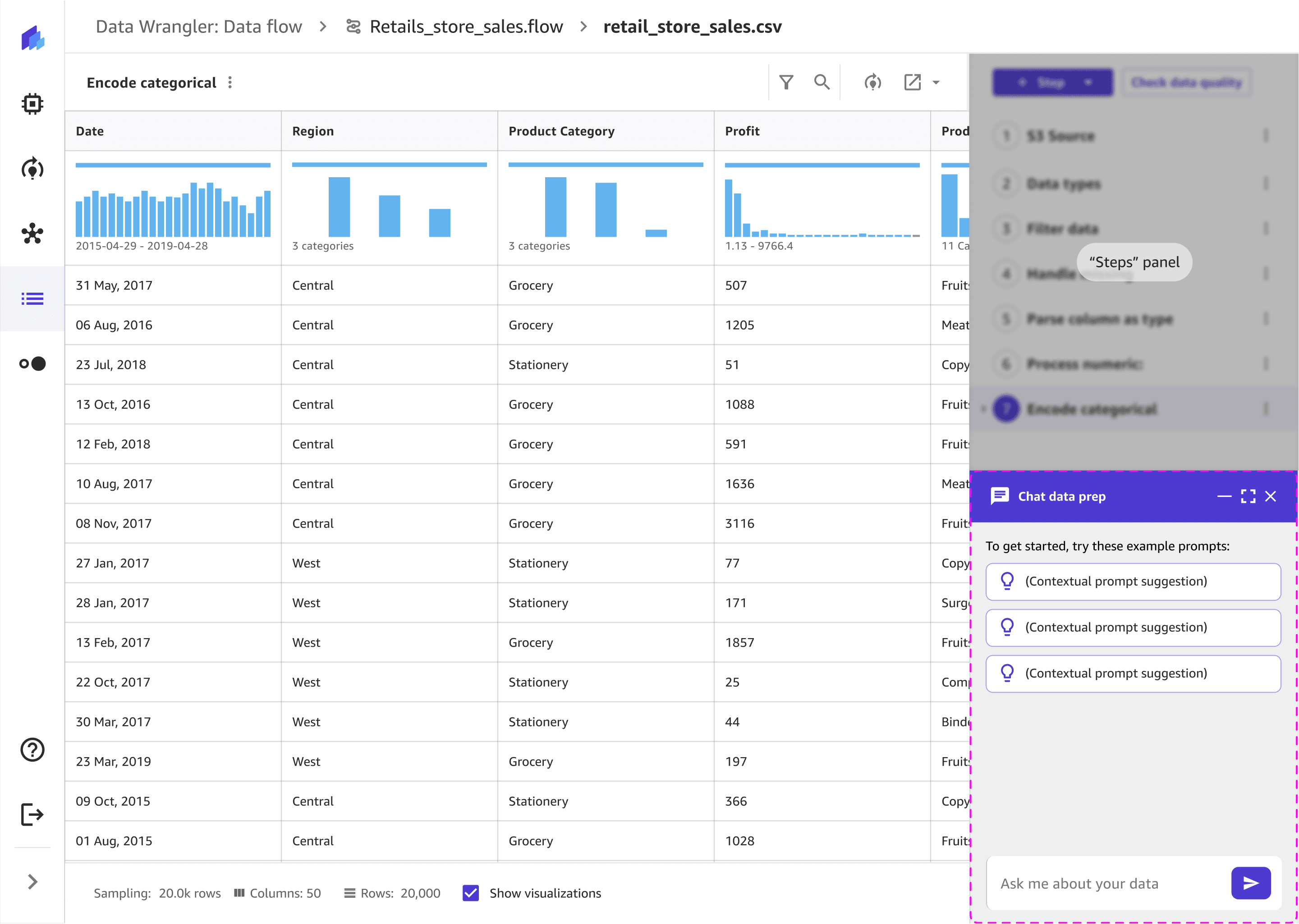
Understand what to do next: Contextual prompts suggest possible actions, helping users know where to start.
Goal 2

Before
Cognitive barrier: Requires technical knowledge
Choice paralysis: 6-7 clicks to configure one task and users must know the correct settings to see results.
After
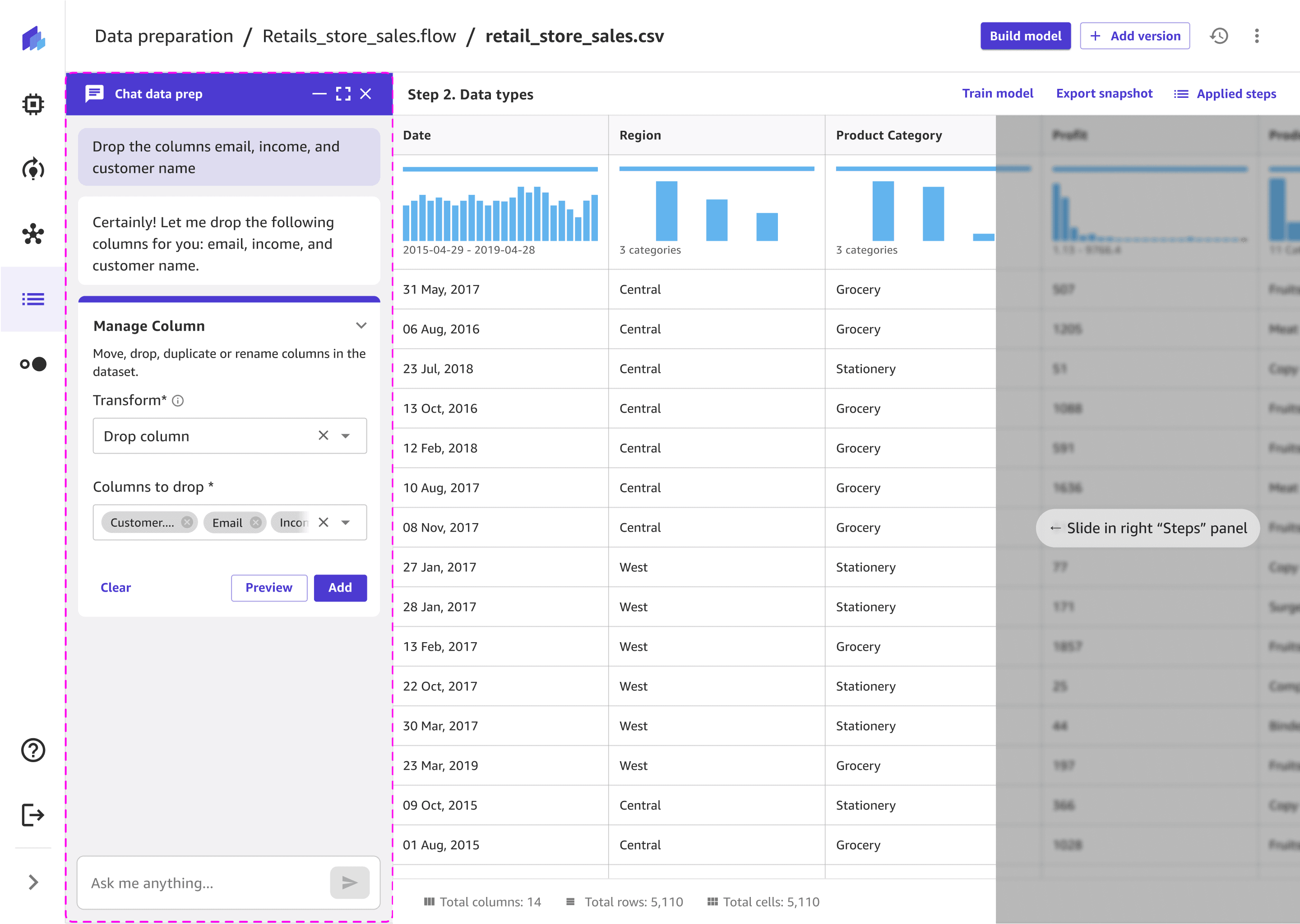
Natural language input lets users describe what they want to do without configuring complex forms.
Simple confirmations reassure users that the system understood their intent, keeping them in control.
Visual real-time previews instantly show results, helping users understand what's happening in their data.
Goal 3
Before
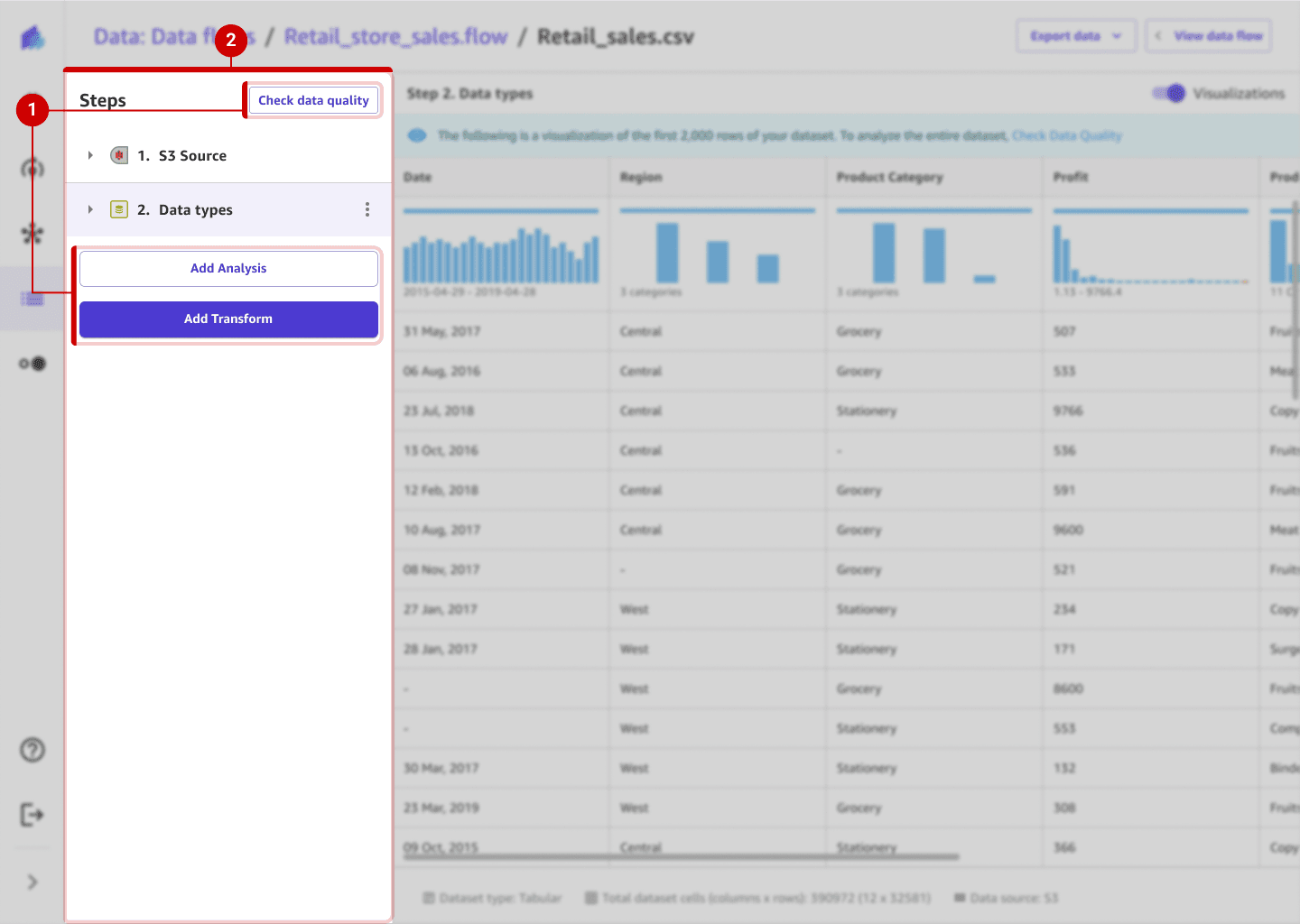
Context switching broke focus: Users had to navigate between multiple panels (Steps, Transforms, and Analyses), losing their mental flow and context for the task.
Fragmented task completion: Each action—checking data, transforming, analyzing—lived in separate places, forcing users to pause and reorient before continuing.
After
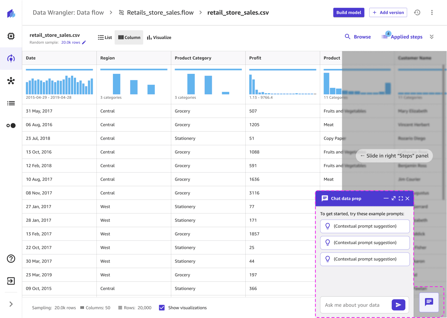
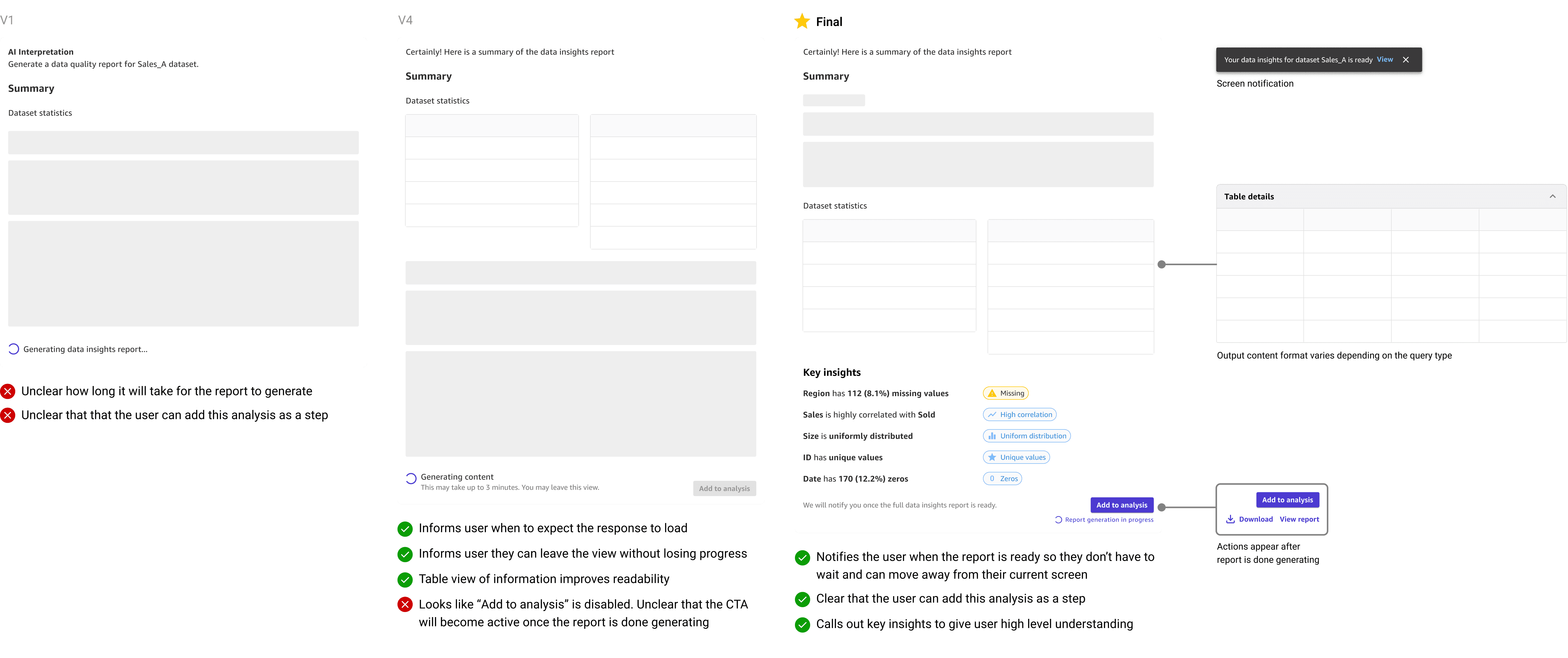
Single, continuous workspace: All actions—conversation, transforms, and analysis—happen within one view, maintaining continuity and reducing context shifts.
Inline execution and feedback: Users can preview, edit, and apply actions directly from the chat or data table, without leaving their current flow.
Integrated visibility: Real-time previews and step confirmations let users see progress instantly, keeping them oriented and confident throughout the workflow.
Goal 4

Before
Non-technical users felt blocked: The interface relied on technical terms and configuration fields, creating a barrier for non-technical users.
Technical users felt slowed down: Experts had to click through multiple dropdowns and fields to perform simple actions — a repetitive, inefficient setup that broke their flow.

After
Plain-language input for all users: Users can describe actions naturally, making complex tasks accessible to non-technical users and faster for advanced technical users.
Advanced view for technical users: Technical users can optionally review or edit auto-generated code for transparency and control.
Implementation and VQA
I worked with engineers to ensure the designs were implemented correctly and delivered at a high bar. We uncovered 174 bugs + visual quality issues as a team. I worked closely with an engineer to design solutions and implement the improvements for 13 UX usability issues in 2 weeks before the MVP launch.
Jump to Final Designs
Next steps
Customer feedback re-directing designs post launch
After launch, users shared that the vertical chat layout made it hard to view their data and chat at the same time, limiting visibility and space for longer conversations.
Since side-by-side layouts weren’t initially feasible, we prioritized a vertical MVP. With feasibility now improved, I proposed revisiting the horizontal layout to give users more flexibility and context — keeping chat interactions consistent but improving usability and balance.

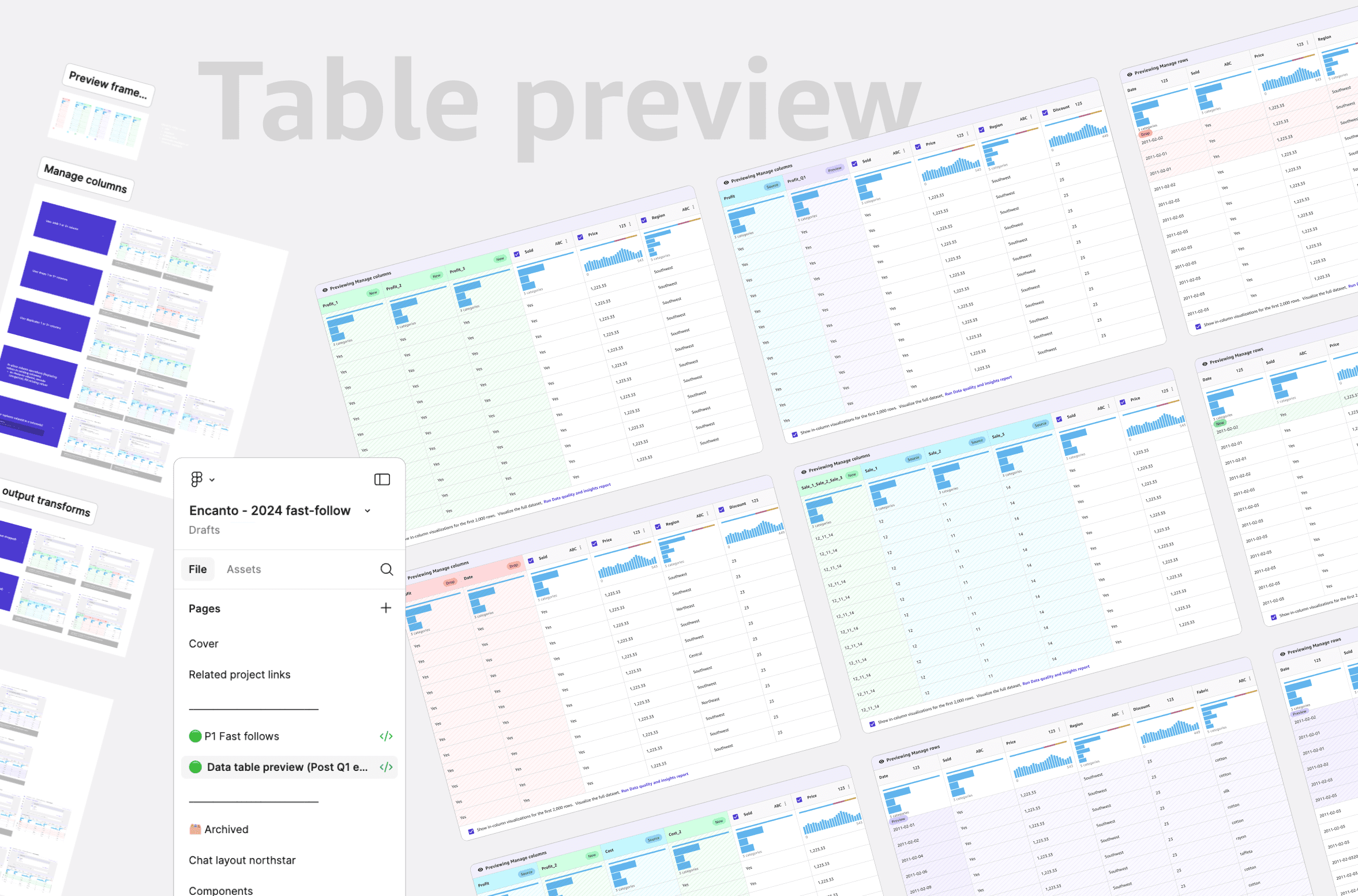
Design system contributions
Building out new chat based components
I designed an improved table preview pattern and contributed to building out new chat components for data preparation from base parent chat components.
Takeaway
Challenges & what I did to overcome them
Fast moving timeline with high ambiguity -> Make decisions quickly but be pragmatic, adjust designs in real-time while moving forward with educated guesses if testing is limited
Designing for technical complexity with no prior domain background -> Dive deep to learn about the domain, gather knowledge by talking to experts. Above all, staying grounded in core UX principles to ensure a intuitive and clear experience.
Shifting requirements with multiple stakeholder dependencies -> Iterate quickly, stay flexible as new edge cases surface. Closely sync with stakeholders to ensure that we designed a cohesive product.

Team wide meeting 1.5 months into the project~